10 Best Packaging Design Ideas for Global Buyers
Packaging design now shapes how global buyers judge quality, responsibility, and reliability before opening a product.
A strong package must survive long transport, changing climates, warehouse handling, and crowded retail shelves. It should also communicate clearly across languages and cultures. Colors, symbols, images, and wording may carry different meanings in different markets. That detail matters. Practical experience shows that attractive packaging can still fail when labels become unreadable, seals weaken, or dimensions increase shipping costs. These ten ideas focus on designs that balance visual appeal with protection, usability, and measurable efficiency.
Good design begins with evidence, not assumptions. Teams should study buyer expectations, test materials, and review packaging performance under realistic conditions. A compact box may reduce storage space, while a molded insert can prevent product movement during delivery. Recyclable materials may support sustainability goals, but only when local collection systems can process them. Claims should remain accurate and easy to verify. Otherwise, trust disappears quickly.
The best solutions are not always the most expensive. Sometimes, a clearer label wins. Small improvements can matter. A better opening tab, stronger corner protection, or multilingual instructions may create a smoother customer experience. However, every concept has limits. Minimal packaging can reduce waste, yet it may expose fragile goods to damage. This guide examines ten packaging design ideas for global buyers, with attention to function, cultural clarity, responsible material choices, and real-world testing. The goal is useful inspiration, not a universal formula. Markets differ, and thoughtful designers must keep questioning their first answer.
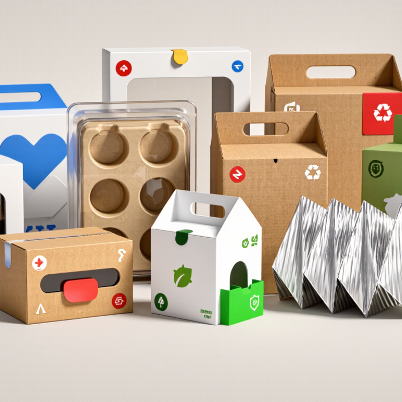
Define Buyer Needs: 72% Say Packaging Influences Purchase (WestRock, 2018)
10 Best Packaging Design Ideas for Global Buyers
Define Buyer Needs: 72% Say Packaging Influences Purchase
A 2018 industry survey reported that 72% of buyers consider packaging when making a purchase. That figure makes one point clear: packaging is part of the product experience. Global buyers often judge quality through color, structure, labeling, and opening comfort. Use clean layouts, readable type, protective inserts, recyclable materials, and clear product windows. Add multilingual instructions when necessary. A compact box may reduce shipping space, but it can also feel disappointing if the product is difficult to remove.
Practical packaging reviews show that small details influence trust. Strong seals prevent damage during long transport. Matte textures can suggest quality, while bright colors improve shelf visibility. QR codes may provide instructions without overcrowding the package. However, visual appeal should not replace honest information. Measurements, materials, care details, and safety guidance must remain accurate. A beautiful package can still fail when it hides important facts. That happens more often than designers expect.
Tips: Interview buyers before choosing a design direction. Test opening, stacking, and reading with real users. Compare two or three prototypes under ordinary lighting. Check whether older customers can read the smallest text. Review recycling guidance for each target market. Do not assume one design fits every culture. It may not. Leave room for improvement after feedback, because early concepts are rarely perfect.
Choose Sustainable Materials: 73% Want to Reduce Environmental Impact (Nielsen, 2019)
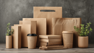
Nielsen’s 2019 global survey found that 73% of consumers want to reduce their environmental impact. For global buyers, packaging must show responsibility before the product is opened. Lightweight paperboard, recycled fiber, and mono-material films can reduce material complexity. Clear recycling instructions also help shoppers make better decisions across different markets. The design should feel practical, not decorative. Excessive layers often suggest waste.
Packaging teams should measure more than appearance. The IBM Institute for Business Value and National Retail Federation reported in 2020 that 57% of consumers were willing to change purchasing habits to reduce environmental impact. Use life-cycle data when comparing virgin and recycled materials. Check transport weight, production energy, durability, and local recycling access. A beautiful package can still fail if it breaks during shipping or cannot be processed locally. The calculation is rarely perfect. That deserves honest review.
Tips: Start with a smaller package footprint. Remove unnecessary inserts. Print with water-based inks where suitable. Add simple disposal icons and short instructions. Test the package through temperature changes, stacking pressure, and long-distance delivery. Avoid vague claims such as “green” without evidence. In practice, one material choice may improve recyclability but reduce moisture resistance. Document that trade-off, then redesign carefully. Packaging decisions should combine verified data, supplier testing, and feedback from buyers in each target region.
Test Shelf Appeal: 64% Try New Products Because of Packaging (WestRock, 2018)
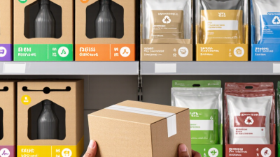
Packaging earns attention before product quality gets a chance. A 2018 consumer packaging study reported that 64% of shoppers tried new products because of packaging. That figure is powerful, but it needs context. It measures trial behavior, not guaranteed loyalty. A bright carton may win the first glance and still disappoint later.
Strong shelf appeal begins with clear visual hierarchy. Use one dominant color, a readable product name, and a visible benefit. Add a small transparent window when texture or freshness matters. Tactile finishes can help, but excessive gloss may look wasteful. Packaging should also work across cultures. Test symbols, colors, and claims with buyers in each target market. Translation alone is not enough. Sometimes, simple design performs better.
Sustainability now affects that first decision. The 2023 Global Buying Green Report found that 82% of consumers were willing to pay more for sustainable packaging. Reduce unnecessary layers, choose practical formats, and show disposal guidance clearly. Avoid vague environmental promises. They weaken trust. Build three mock shelf versions and test them with real users. Record which package they notice first, understand fastest, and remember later. A useful warning: controlled testing can still miss crowded stores, poor lighting, or hurried shoppers. Real shelves are messier.
Packaging can strongly influence product discovery: 64% of surveyed consumers reported trying a new product because of its packaging, while 36% did not report this behavior. Clear visual hierarchy, distinctive structure, and easy-to-understand information can help improve shelf appeal.
Source: 2018 consumer packaging survey; percentages shown as reported and calculated remainder.